Welcome, friends of all things bright and beautiful! Today, we’re setting off to explore the vibrant world of color combinations. Whether you’re painting, crafting, or decorating, understanding how colors work together is essential. So let’s get ready to add some color magic to our projects.
Understanding Color Theory
Embrace the World of Color Combinations – Uncover the Magic Within!
Hello, marvelous makers and vibrant visionaries! Today, we’re embarking on a colorful journey — diving deep into the foundation of captivating color combinations. Whether you’re adorning a canvas, giving life to yarn, or adding a dash of color to your living space, understanding color harmony is your golden key. So, grab your favorite palette, and let’s spread some color magic.
Before we jump in, a tiny confession: I am utterly fascinated by the power of colors. They tell stories, evoke emotions, and create magic before our eyes. And today, I’m thrilled to share this passion with you, revealing how simple it is to master the art of blending shades.
The Color Wheel – Your Best Friend in Color Harmony
Imagine the color wheel as your loyal guide in the enchanting world of hues. It’s a simple yet powerful tool that shows the relationship between colors. Created by Sir Isaac Newton, this circular diagram is your compass for mixing and matching colors with confidence.
Unraveling the Mystery: Primary, Secondary, and Tertiary Colors
- Primary Colors – Red, yellow, blue. These are your color heroes! They’re the foundation from which all other colors are made. Think of them as the root of your color exploration tree.
- Secondary Colors – Orange, green, violet. These are born when you mix two primary colors together. They expand your palette, adding depth and variety to your designs.
- Tertiary Colors – By mixing a primary color with its neighboring secondary color, you birth a tertiary color. These are your red-orange, yellow-green, blue-violet shades – they add spice and nuance to your color concoctions.
The Key to Captivation: Color Harmony
Color Harmony is about creating a visually appealing feast for the eyes. It’s the secret ingredient to making your work stand out. There are several schemes, but let’s touch on three main ones:
- Complementary Scheme – This involves colors directly opposite each other on the color wheel. Think blue and orange, or red and green. These combinations create a vibrant look that’s full of life.
- Analogous Scheme – These colors sit side by side on the wheel, like best friends. They create serene and comfortable designs with their harmonious flow. Picture the peaceful pairing of blue-green, green, and yellow-green.
- Triadic Scheme – This daring trio is made of colors evenly spaced around the color wheel, forming a triangle. It offers vibrant harmony but balanced. The classic combo of red, blue, and yellow is a perfect example.
Embracing Emotion and Mood
Colors speak in emotions. Warm colors like red and orange evoke feelings of warmth and excitement, while cool colors like blue and green invoke calmness and serenity. The right combination can set the mood you desire.
Captivating color combinations don’t just happen; they are curated with intention. Understand the mood you wish to create. For a cozy atmosphere, lean towards warm, earthy tones. For a refreshing vibe, sprinkle your palette with cool blues and greens.
You hold the power to evoke emotions and narrate stories with just colors. The knowledge of chromatic harmony, the wheel as your guide, and a heart full of experimentation — you’re all set to breathe life into your creations.
With these essentials in your artistic arsenal, go forth and manifest beauty. There’s a whole spectRum waiting for your touch. Until our next colorful adventure — happy creating!
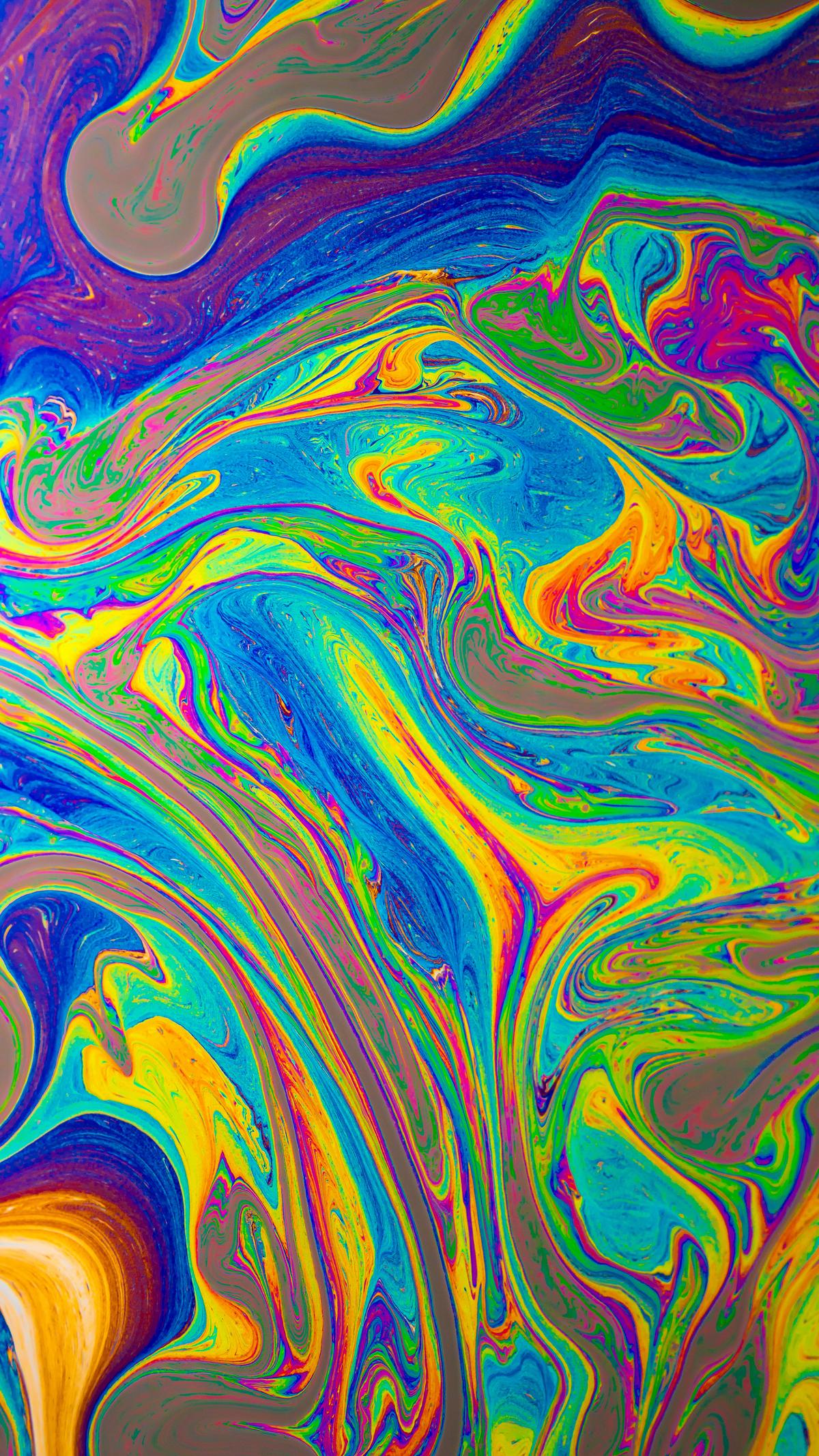
Photo by danesduet on Unsplash
The Rule of Threes in Color Schemes
Embracing the Art of Accents: Unlocking the Magic of the Rule of Threes
Ever notice how in the grand tapestry of design, certain color combinations make your heart sing, while others seem to fall a bit flat? The secret maestro behind many of these eye-catching ensembles is often the rule of threes. This simple yet profound guideline can be the key to transforming your color choices from mundane to magical. So, grab your color palettes, and let’s dive into the whimsical world of the rule of threes.
Understanding the Rule of Threes
At its core, the rule of threes in color theory is about creating a visually harmonious blend by using three colors. But here’s the intriguing part – it’s not just any trio of colors thrown together in a hodge-podge manner. It’s three colors cleverly chosen based on their positions on the color wheel, ensuring every shade complements the others, invoking balance and visual appeal.
Constructing Your Color Triad
Imagine this: You’re standing before your canvas (or room, garment, or garden – the world is your oyster), ready to apply this rule. Here’s how to proceed:
- Choose Your Dominating Darling: Select a color that captures the essence of what you’re creating. This color will take center stage and be the primary hue dominating your palette.
- Find Your Supporting Superstar: Next, pick a second color that contrasts yet beautifully complements your star hue. This color supports but doesn’t overshadow your primary choice, bringing depth and variety.
- Select the Subtle Sidekick: Lastly, include a third color, often a neutral or softer tone, to balance the energy between the dominating and supporting stars. This color ties everything together, ensuring harmony and giving your eyes a place to rest.
Application in Action: Let’s Play with Palettes
To see the rule of threes in action, let’s embark on a miniature adventure:
- Imagine choosing a vibrant teal as your Dominating Darling for a crochet project. It’s bold, it’s beautiful, it’s you.
- Then, as your Supporting Superstar, you bring in a fiery coral – a contrast that sings in harmony with teal, adding warmth and spice.
- Lastly, your Subtle Sidekick could be a soft cream or luscious grey, offering a neutral canvas that makes the teal and coral pop without competing for attention.
Voilà! You’ve created a trio that turns heads and warms hearts. The beauty lies in the balance, with each color assuming its role in the symphony, creating a melodious visual effect.
Why It Works: The Psychology of Threes
Here’s a little secret: our brains love patterns, particularly in odd numbers. The rule of threes in color theory satisfies this intrinsic penchant for asymmetry, making designs and combinations feel more vibrant, dynamic, and memorable. It’s like listening to a piece of music where every note finds its perfect place – it just feels right.
Embrace Experimentation: Your Creative Canvas Awaits
The most exhilarating part about the rule of threes? It’s a guideline, not a hard-set rule. The magic happens when you mix, match, experiment, and play with colors until you find the trio that strikes a chord with your personal style and the mood you wish to evoke. So, wield your creative power with confidence and let the rule of threes transform your color choices into resounding harmonies.
Remember, every splash of color tells a story – make yours unforgettable with the artful application of the rule of threes. Now, go forth, experiment with gusto, and watch as your world becomes a canvas painted in the colors of your imagination.
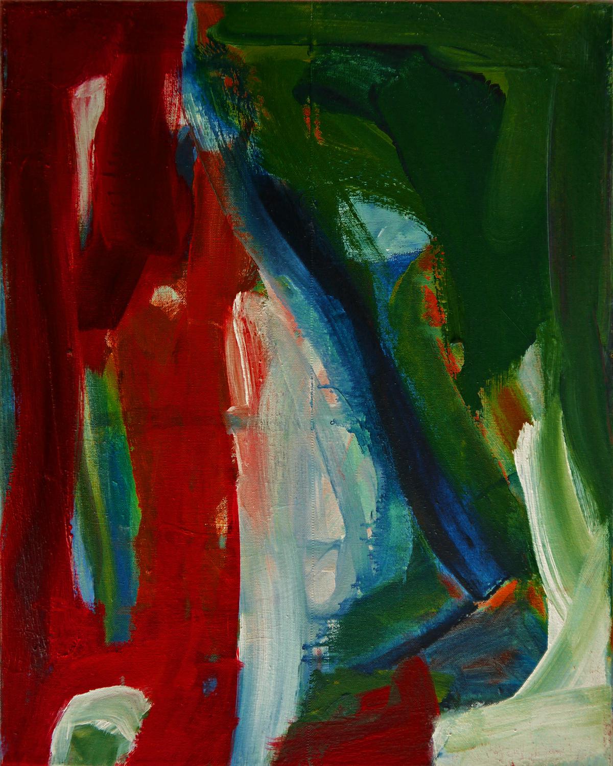
Photo by heijnsbroek_abstract_art on Unsplash
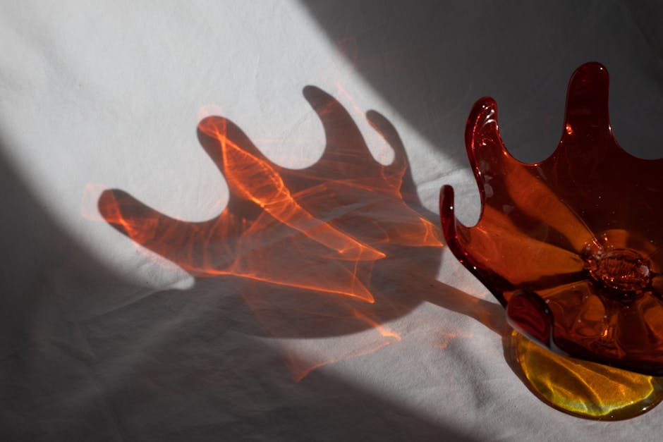
Experimenting with Color Contrast
Alrighty, crafty friends, let’s dive deep into one of the glittering jewels of crafting – the magic of contrast. Why, you ask, is contrast such a superstar in the realm of vibrant creations? Well, sit tight, as we unravel this vibrant skein of wisdom together, you’re in for a colorful journey.
Introducing Contrast: The Dazzling Dance of Differences
Think of your crafting space as a stage, and contrast as the spotlight. Just as a well-placed spotlight can transform a performance, contrast can elevate your creations from lovely to absolutely mesmerizing. It’s all about the dazzling dance between different elements that captures the eye and keeps it moving, twirling from one detail to the next.
Contrast Unveiled: More than Meets the Eye
Contrast isn’t just about colors shouting across the wheel to each other (although they do love a good chat); it’s about differing textures, sizes, and shapes too. It creates a visual interest that’s as irresistible as a mystery novel you cannot put down.
- Textures’ Tantalizing Tale: Imagine you’re creating a knitted sweater. Pairing smooth, silky yarn with a section of chunky, cozy wool creates an intriguing tactile experience. It’s like a visual whisper, urging folks to lean in closer and admire the craftsmanship.
- The Symphony of Sizes: In a galaxy of beads sprawling across a bracelet, where giant planets and tiny moons coexist in harmony, contrast is what makes your eye wander, discover, and appreciate each bead’s unique role in this cosmic dance.
- Shapes and Silhouettes: Playing with shapes can be as joyful as cloud-watching. In quilting, for instance, juxtaposing sharp, geometric shapes with soft, flowing curves creates a dynamic dialogue within your creation. It’s as though different elements are sharing stories across the quilt.
The Highlight Reel: Why Contrast Reigns Supreme
Why does contrast wear the crafting crown so gracefully? Let’s spotlight three sparkling reasons:
- Guides the Gaze: By masterfully maneuvering contrast, you’re like a skillful director. You guide your audience’s gaze where you want it—a symphony conducted with yarn, beads, or fabric.
- Evokes Emotions: Contrast can stir emotions ranging from serene tranquility when subtle, to vibrant vitality when bold. Your creation doesn’t just exist; it feels.
- The Spice of Intrigue: Ever gazed at a piece wondering, “How did they do that?” That’s contrast working its enchanting spell. It adds layers of curiosity and depth, making your creations not just seen but explored.
So, my creative confidants, as you next sit to birth a new project from your heart and hands, remember that contrast is your dazzling partner in the dance of creation. Adjust the spotlight of contrast, and watch as your work takes on a life of its own, captivating hearts and inspiring minds.
In this colorful symphony of creation you’re composing, let contrast lead, making each piece not just crafted but profoundly felt and remembered. Now, go forth and craft with colorful confidence; the canvas of creativity eagerly awaits your vibrant visions.
As we wrap up our exploration of colors and their contrasts, remember that each choice you make adds a unique touch to your creations. With the tools and knowledge at hand, you have the power to bring emotions and stories to life through color. Keep experimenting with boldness and confidence; your next masterpiece is just a palette away.
Revolutionize your content with Writio, an intelligent AI writer. This article was crafted by Writio.
Leave a Reply