Welcome to the vibrant world of colors, where the secrets of the color wheel await to unlock endless possibilities for creativity and design. As we explore together, you’ll discover how understanding this fundamental tool can elevate your projects, whether in art, fashion, or interior design. Let’s embark on this exploration with an open mind and a keen eye for color.
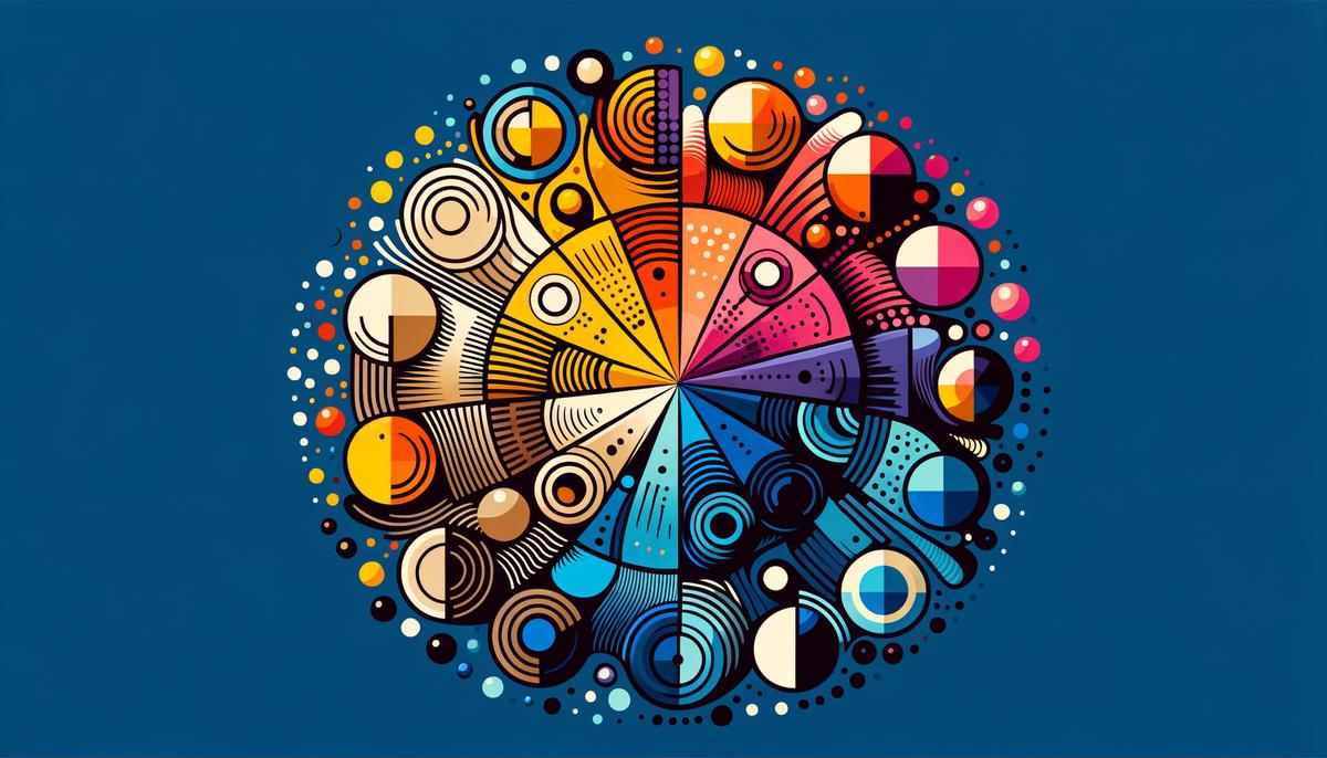
Understanding the Color Wheel
Welcome to the wonderful world of colors, where we’re diving into the secrets of the color wheel and how it can guide you to create stunning color combinations! Whether you’re painting, designing, or just jazzing up your wardrobe, understanding the color wheel is your first step toward making those eye-catching choices.
First things first, let’s unravel the mystery of the color wheel. Picture a beautiful rainbow morphed into a circle, and voila, you’ve got the color wheel! It’s a simple yet powerful tool in choosing harmonious colors.
Understanding the Basics:
The color wheel consists of three types of colors: Primary, Secondary, and Tertiary. Stick with me; it’s easier than it sounds!
- Primary Colors: Red, Yellow, and Blue. These are the big bosses of the color world. You can mix them to get all other hues but can’t create these three by mixing others.
- Secondary Colors: Green, Orange, and Purple. Each is created by mixing two primary colors (think Yellow + Blue = Green).
- Tertiary Colors: These are the offspring of primary and secondary colors. For example, mixing red (primary) and orange (secondary) gives you red-orange, a tertiary color.
Creating Harmony:
Now that we’ve cracked the code on color types, let’s dance our way through combining them effectively using the color wheel!
- Analogous Colors: These are next-door neighbors on the wheel, sharing a primary color. Examples include blue, blue-green, and green. They’re like best buds hanging out, creating serene and comfortable designs.
- Complementary Colors: Found directly opposite each other on the wheel (e.g., red and green), these combinations are the life of the party! They create a vibrant look high in contrast. It’s all about balance; when they’re together, they shine brighter.
- Monochromatic Scheme: This is all about variations in lightness and saturation of a single color. Imagine a sea of blues from sky blue to deep ocean blue. It’s a refined and elegant approach delivering visual coherence.
- Triadic Colors: Three colors equally spaced on the wheel, like red, yellow, and blue. This scheme is harmonious and vibrant, offering a balanced mix with richness and depth.
Tips and Tricks:
- When starting out, choose one dominant color and use others for accents.
- Test your combinations in different lights; colors can change dramatically!
- Don’t be afraid to experiment. The best part about the color wheel? It’s a guide, not a rulebook.
There you have it! With the color wheel in your toolkit, you’re well on your way to creating combinations that pop. So grab your paints, clothes, or whatever canvas you choose, and play with colors. The possibilities are endless—and absolutely beautiful. Stay bright, stay bold, and let the colors guide you to your masterpiece.
Exploring Color Harmony
Diving Deeper into Color Harmony
Discovering the secrets behind creating harmonious color combinations goes beyond just understanding the color wheel and its components. The language of colors is vast, and knowing how to speak it fluently can transform your projects from the mundane to the magnificent. Let’s unwrap some additional strategies and principles that can elevate your color combinations to new heights.
Understanding Color Temperature
Color temperature plays a pivotal role in setting the mood of your piece. Colors are often categorized into two groups: warm (reds, oranges, yellows) and cool (blues, greens, purples). Warm colors evoke energy and positivity, while cool colors bring about calmness and tranquility. To create harmony, consider the atmosphere you want to establish. Mixing warm and cool hues wisely can result in a balanced visual experience that engages the viewer effectively.
Leveraging Neutral Colors
Neutral colors (black, white, gray, and sometimes brown and beige) are the unsung heroes of color harmony. They offer a buffer that allows brighter colors to pop without overwhelming the senses. Incorporating neutrals into your palette provides a foundation that can enhance vibrancy or dial down intensity, depending on your goal. An accent wall in a bold color against neutral-colored surroundings can create an eye-catching focal point in interior design, as an analogous approach in artwork guides the viewer’s attention smoothly.
Saturation and Brightness
The saturation of a color refers to its intensity, whereas brightness (or value) refers to how light or dark the color is. Playing with these factors can lead to stunning variations, even within a single color scheme. A bright, saturated hue can make elements jump forward, while desaturated or darker versions of the same color might recede, adding depth and interest to your composition. Experimenting with saturation and brightness can help achieve balance and unity within diversity.
Don’t Forget About Context
The context in which colors are used can significantly influence perception and effectiveness. Colors might trigger different emotions or associations based on cultural understandings or personal experiences. Furthermore, the same color can look differently depending on its surroundings. It’s essential to consider the setting and context of your color choices to ensure they convey the intended message or feeling.
Practice with Real-Life Applications
Theory is wonderful, but practice makes perfect. Take these principles for a spin with real-life applications. Mix and match throw pillows of various color temperatures on your couch. Use software or apps to digitally test out paint color combinations for rooms before making a decision. In crafting, blend yarns or fabrics in unexpected ways to see how the principles of color harmony play out in tangible forms.
Join a Color-Savvy Community
Embarking on your journey to master color harmony becomes even more enriching when you share and learn with others. Join forums, social media groups, or local clubs where you can exchange ideas, challenges, and triumphs with fellow color enthusiasts. This community support can inspire you, provide constructive feedback, and help you see colors in ways you might not have considered.
As we reach the end of our exploration into the secrets behind creating harmonious color combinations, remember that rules serve as guidelines rather than strict boundaries in the realm of color. Personal taste, experimentation, and the joy of discovery should always lead your creative adventures. Now, armed with a deeper understanding of color harmony, let your projects shine with an informed palette that tells your unique story through colors that speak beautifully together.
The Impact of Color in Design
Alright, crafters and visual magicians, buckle up! Today, we’re diving deep into the enchanting world of colors, particularly addressing how they not only catch the eye but also tug at the heartstrings and whisper to the mind in subtle ways. By now, you’re equipped with a grandiose color wheel, pulsating with potential – it’s time to pivot from the theory to the transformative power of color in design. Grab your palette (virtual or otherwise), and let’s paint our way through the myriad ways colors influence mood and perception in our creations.
Color and Mood: The Emotional Alchemy
Remember those days when feeling blue wasn’t just about being sad – it was staring into the ocean’s depth on a canvas and instantly feeling a rush of calm? Or that red wasn’t merely a color, but a heartbeat, a visceral reaction akin to love or war? Color psychology is real, my friends, and it’s pivotal in setting the mood of your designs. Soft pastels can whisper soothing lullabies creating serene and gentle spaces. In contrast, vibrant shades like electric yellow or fiery red scream energy and vitality, perfect for spaces craving dynamic pulses.
The Power of Perception, Crafted by Hue
The hues you choose are not silently sitting by; they’re communicating, shaping perceptions without uttering a single word. For instance, green – the heartthrob of nature – it’s not merely inviting you in; it’s signifying growth, vitality, or even sustainability. Opting for earthy browns and greens can lend an organic, grounded feel to your designs, nudging the viewer towards a perception of eco-friendliness and naturalism.
The Influence of Cultural Context
Now, let’s thread carefully here – colors talk differently across the globe. What’s joyful and vibrant in one culture might be a marker of mourning in another. This vast cultural color spectrum means being mindful about the global tapestry of your audience. Your design isn’t just staying in your neighborhood – it’s a digital wanderer; hence your color choices must be attuned not just to aesthetics but cultural sensitivities and narratives.
Contrasting and Harmonizing: A Balancing Act
Playing matchmaker with colors? Absolutely! It’s not just about throwing in pieces together; it’s about creating a visual symphony. Your vibrant heroes need the steadfastness of their neutral companions – a pop of color here balanced with soothing beige or grey can enhance comfort without overpowering senses. It’s the art of balancing contrast and harmony that directs viewers’ eyes effortlessly across the design, rendering both rest and spark where needed.
Bringing It All Together: Practice Makes Perfect
Test these principles real-time — sketch, paint, digitize. Note how different hues interact, observe the emotions they evoke, and keep an intuitive eye on balance and contrast. Eventually, your instinct aligned with these insights will make your designs not just seen but felt and experienced.
As we wrap up (bringing it full circle without a traditional summary), remember that mastering colors in design is akin to learning a new language — it’s not just science; it’s poetry, emotion, and a dash of magic, all speaking directly to the beholder’s heart. Keep experimenting, keep learning, and who knows? Your next creation might just be the masterpiece that speaks a thousand words, without whispering a single one.
As we wrap up our exploration of colors and their profound impact on design, remember that mastering the art of color is an ongoing process that blends both knowledge and intuition. By applying the principles discussed, you’re well-equipped to create designs that not only look stunning but also resonate deeply with viewers. Keep experimenting with colors and let your creations tell compelling stories that captivate and inspire. The world is your canvas—paint it with boldness and brilliance.
Leave a Reply