Colors play a pivotal role in our lives, shaping how we perceive the world around us and influencing our emotions and decisions. This article embarks on an exploration of the color wheel, a fundamental tool in understanding color relationships, and delves into how colors can harmonize to create appealing designs and evoke specific moods. By examining the science and psychology behind colors, we aim to equip you with the knowledge to make informed choices in your creative endeavors.
Understanding Color Wheels
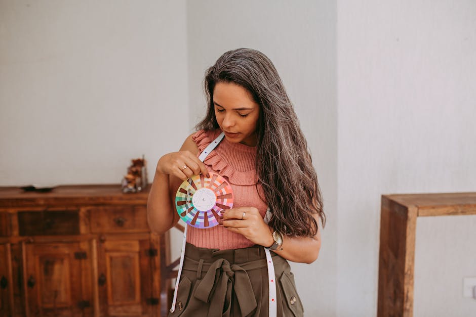
Ah, the Color Wheel. A magnificent tool that’s as enchanting as it is practical, especially when you’re diving into the world of color theory. Picture this: a rainbow unfurling into a circle, where every hue speaks a language of emotion and vision. That, my friends, is the essence of a color wheel.
At its heart, the color wheel is a visual representation of colors arranged according to their chromatic relationship. Fathered by Sir Isaac Newton in 1666, it has evolved into an indispensable tool in the hands of artists, designers, and decorators across the globe.
Why, you ask, is this kaleidoscopic chart so crucial? Let me walk you through its wonder.
Kickstarting Creativity and Harmony
Imagine picking colors at random for a project. Overwhelming, right? The color wheel simplifies this process. It guides us in choosing a harmonious palette, ensuring that our creations are visually appealing. It’s like having a compass in the vast sea of colors, always pointing us towards harmony.
Communicating Through ColorsColors tell stories and evoke emotions. The color wheel helps decode this language. Want a serene vibe? Reach for the blues and greens snugly placed next to each other on the wheel. Seeking drama and excitement? Dial up the contrast with colors sitting opposite each other.
Exploring the Depths of Color Relationships- Complementary Colors: Colors directly opposite each other. Think red and green. It’s Christmas all year round with the vibrancy they offer when paired.
- Analogous Colors: These are neighbors on the wheel, like blue, blue-green, and green. They’re BFFs that promise a serene and comfortable look.
- Triadic Colors: Three colors spaced evenly apart. Picture red, yellow, and blue – a trio that sings in perfect harmony.
The beauty of the color wheel doesn’t stop with creating appealing color schemes; it’s also about bringing balance. Balancing cool and warm tones ensures your work has just the right temperature.
Whether you’re knitting a sweater, painting a landscape, or choosing cushions for your sofa, the color wheel is your go-to guide for making informed color choices. It empowers us to mix and match with confidence, taking our creative projects from good to absolutely enchanting.
So, next time you embark on a project involving colors, remember: The color wheel is not just a tool; it’s your artist’s compass, guiding you through the mesmerizing world of color theory. With it by your side, every choice becomes a step towards creating something truly magical.
Exploring Color Harmony
Now that we’ve dipped our toes into the vibrant sea of color theory and have a solid understanding of the color wheel, let’s dive deeper into practical steps to achieve harmony in our creative endeavors. Whether it’s sprucing up our living space, designing a stunning visual presentation, or simply piecing together a fabulous wardrobe, the secret sauce is in the color harmony.
Introducing Tints, Shades, and Tones
While the primary, secondary, and tertiary colors give us a fantastic starting point, playing with tints, shades, and tones opens up a whole new world of possibilities.
- A tint is created by adding white to a color, making it lighter. This can soften a design and add a touch of serenity.
- A shade comes into being by mixing black with a color, darkening it. Shades bring depth and solidity to compositions.
- A tone is produced by adding gray to a color, which can either warm it up or cool it down, depending on the undertones of the gray.
Experiment by incorporating these variants to add complexity and intrigue to your color schemes.
Utilizing Neutrals for Balance
Neutrals – blacks, whites, grays, and sometimes browns – are the unsung heroes in the quest for harmony. They balance out the vibrancy of brighter colors, giving the eye spots to rest. In design and decor, neutrals can act as grounding elements, letting the more vivid colors shine without overwhelming the senses. Think of a room painted with warm gray walls housing a royal blue sofa – the gray balances the energy of the blue, creating a harmonious space.
Personalizing with Accent Colors
Accent colors are like the cherry on top. They can be bold or subdue but always add that final touch that pulls everything together. When selecting an accent color, think about what you want to achieve:
- Do you want to invigorate your space with energy? Go for an accent color opposite your main color(s) on the wheel.
- Looking for subtlety? Select an accent that’s next to your chosen hues on the wheel.
Remember, the key with accent colors is moderation. They’re meant to complement, not compete with your primary choice.
Creating Mood with Color Harmony
The emotions evoked by our color choices create the mood. A room bathed in soft blues and greens ushers in calmness, making it ideal for bedrooms or studies. On the other hand, a marketing flyer crafted with bold reds and yellows can exude excitement and urgency.
What mood do you wish to convey? Let that question guide your color harmonization efforts. Reflect on your desired emotional outcome and sprinkle your project with colors that achieve just that.
Practicing and Experimenting
The final step, and perhaps the most joyous, is to practice and experiment. No rule says you must stick firmly to tried-and-tested schemes. The beauty of creativity lies in breaking rules and discovering what resonates personally or with your intended audience.
Start with small projects or a single element – a pillowcase design, a webpage header, a painting corner. Document what combinations you use, how they make you feel, or the feedback you receive. Over time, you’ll develop an intuitive sense of what works, leading you to create projects that aren’t just harmonious but downright enchanting.
In creating color harmony, remember this isn’t about hard-fast rules but about giving yourself permission to play, to explore, and ultimately, to express the unique palette of your soul. Let the colors dance together, balancing, enhancing, and whispering stories that words alone can’t tell. And above all, enjoy the process – for it’s in this creative play that true harmony lies.
The Psychology of Color
Alright, let’s dive deeper into the fascinating world of color and emotions. Colors do more than just beautify our surroundings; they have the power to influence our feelings and moods in remarkable ways. Ever wonder why a baby blue room feels calm and serene, or why a ruby-red dress gives you a boost of confidence? It’s all about the emotional impact of colors.
First things first, colors speak a universal language that goes beyond words. We react to colors both physically and psychologically. For instance, warm colors like red, orange, and yellow can evoke feelings of warmth and comfort but also ignite emotions of passion, excitement, or anger. Conversely, cool colors such as blue, green, and purple tend to bring about a sense of calm, peace, but sometimes can slide into sadness or aloofness.
Let’s break it down color by color to see how each hue influences our sentiments:
- Red isn’t just the color of love. It’s a powerful color that grabs attention. It symbolizes strong emotions such as love, energy, and danger. Its vigor can increase one’s heartbeat! It’s why “STOP” signs are red; they demand action.
- Orange combines the energy of red and the happiness of yellow. It stimulates creativity, enthusiasm, and is often associated with energy and sunshine. It’s the perfect pick-me-up color on a gloomier day but use it moderately as it can also suggest caution.
- Yellow, the color of sunlight, is all about joy, happiness, and youthfulness. It can illuminate dark spaces and bring a lively vibe to any room. However, in overabundance, it might cause uneasiness; ever noticed how babies cry more in yellow rooms?
- Green echoes the vitality of nature, symbolizing growth and harmony. It’s a restful color that symbolizes renewal and healing. Being in a green room can help us feel refreshed, but too much green can lead to feelings of complacency and too much laid-back energy.
- Blue, a tranquil presence, it’s often associated with stability and calmness. It can lower pulse rate and body temperature. It suggests loyalty and integrity but watch out; darker shades can invoke feelings of sadness or aloofness.
- Purple combines the calm stability of blue and the fierce energy of red. Often associated with royalty, it symbolizes luxury, power, and ambition. It also represents wisdom and dignity. Lighter shades can spark romantic or nostalgic feelings.
Remember, there’s no strict rulebook for how you should feel about a certain color. Personal experiences often influence our perception of color. What’s calming for one can be saddening for another. Embrace your unique reactions to colors and use them to create spaces that feel right for you.
The exploration of color emotionally is a journey not just through the eyes but through the heart. Play around with colors, mix them, match them, shade them up or down, and notice how they change the feeling of a piece or space.
There you have it! Understanding the emotional ties we have with colors can significantly affect not only our mood but also our behavior. So next time you’re picking out a paint color for a room or deciding on an outfit, think about the emotions you want to evoke. Paint your life in the colors that bring you joy and inspiration.

As we wrap up our exploration of colors and their profound impact on our lives, it’s clear that understanding color theory is not just about enhancing aesthetics—it’s about crafting experiences that resonate on a deeper emotional level. The power of colors extends beyond mere decoration; it influences mood, communicates messages, and shapes perceptions. Armed with this knowledge, you’re now better prepared to wield colors in ways that truly reflect your intentions and aspirations. Let this newfound understanding guide you as you paint your projects—and your life—with the hues that best tell your story.
Leave a Reply